Genie
Founded and designed a node canvas for creators who don’t think in graphs. 2 years owning product definition, interaction model, and prototypes.
- Client
- Genie, my own product
- Role
- FounderProduct definitionInteraction modelPrototypes
- Year
- 2024 – 2026
- Discipline
- Product DesignAI / ML InterfacesPrototypingDesign Systems

A node graph is a beautiful way to express a pipeline and a hostile way to meet a creative tool for the first time. The convention the whole category inherited — every capability is a node, find it by typing its name, wire the outputs to the inputs — assumes you already hold a model of the system in your head. Artists do not arrive with that model, and there is no reason they should: they arrive with an intention. "Remove this background." "Make this sharper." "Try it as a video." The gap between those two things is the entire design problem, and most node editors resolve it by asking the artist to become an engineer.
My first taxonomy was about us, not them
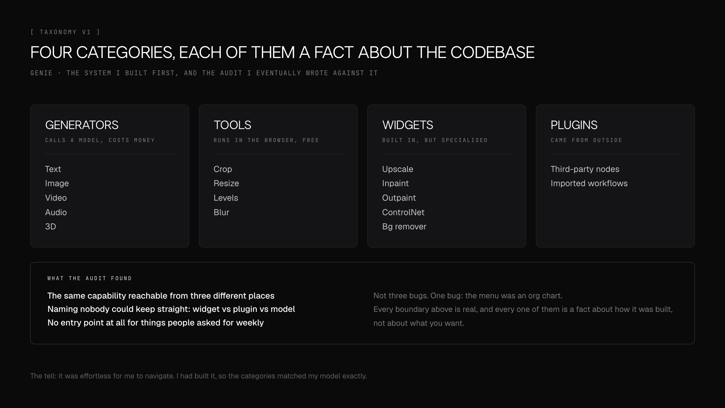
Genie’s original canvas had four layers: Generators, Tools, Widgets, Plugins. I can reconstruct exactly why. Generators call a model and cost money. Tools run deterministically in the browser. Widgets are built-in but specialised. Plugins come from outside. Every one of those boundaries is real, and every one of them is a fact about the codebase.
None of them is a fact about the person using it. Nobody has ever wanted a Widget. The audit I eventually wrote against my own system listed the symptoms plainly: the same capability reachable from three different places, naming nobody could keep straight — widget versus plugin versus model — and entry points that simply did not exist for things people asked for weekly. Those are not four separate bugs. They are one bug, which is that the menu was an org chart.
The tell is that the taxonomy was easy for me to use. I had built the thing, so the categories matched my model perfectly. That is the trap in designing a tool you also engineer, and it is not solved by being careful. It is solved by watching someone else fail to find something you can find instantly.
Two questions instead of four categories
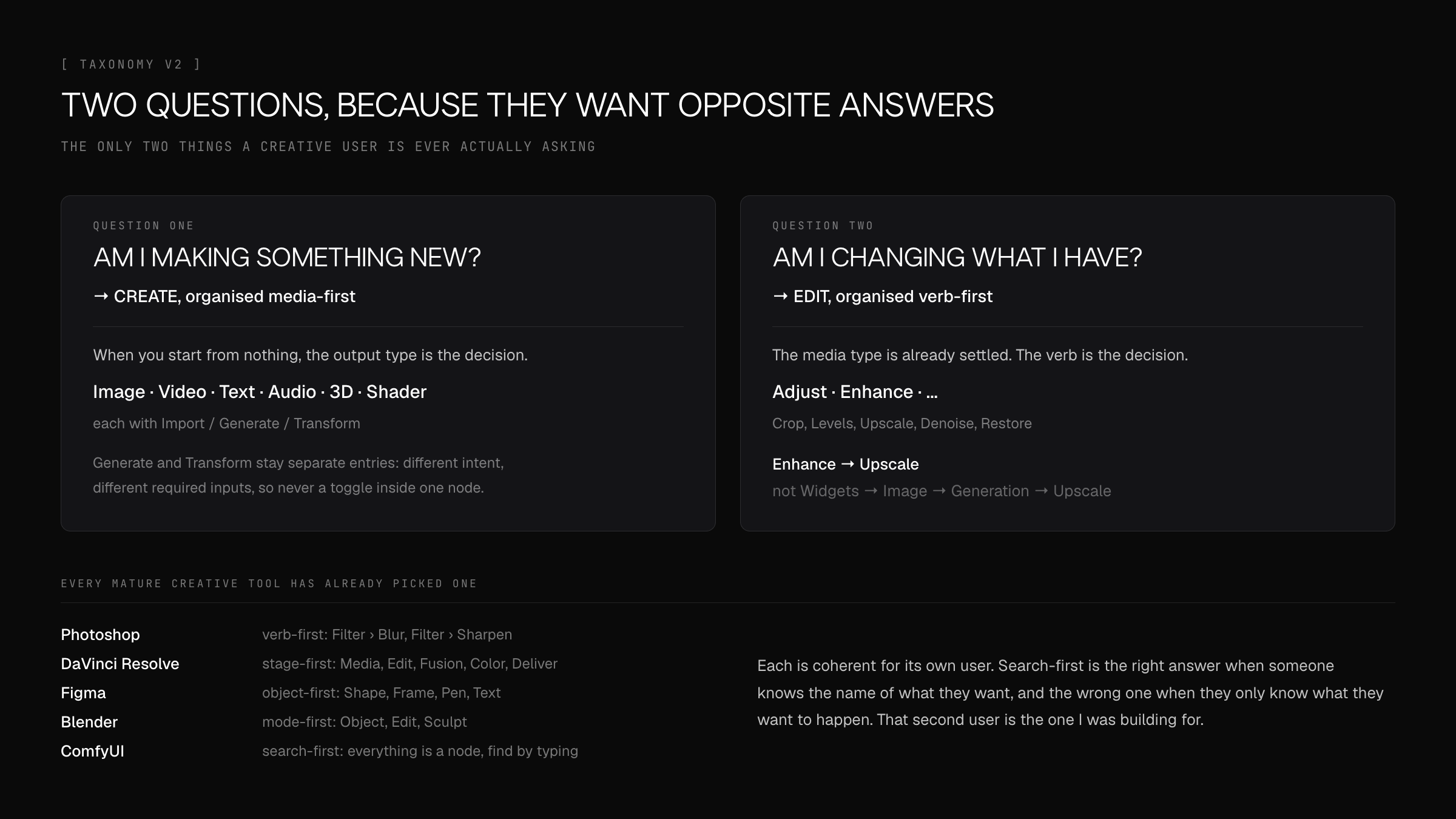
The replacement has two layers, and they come from the only two questions a creative user actually asks: am I making something new, or am I changing something I already have?
Those two questions want opposite organising principles, which is why one flat menu could never serve both. When you are creating from nothing, the output type is the decision — image, video, text, audio, 3D — so CREATE is organised media-first. When you are modifying something that exists, the media type is already settled and the verb is the decision, so EDIT is organised intent-first: Adjust, Enhance, and so on. "Enhance → Upscale", not "Widgets → Image → Generation → Upscale".
I did not derive this in a vacuum. Every mature creative tool has already made this choice and made it differently: Photoshop is verb-first, DaVinci Resolve is stage-first, Figma is object-first, Blender is mode-first, ComfyUI is search-first with no hierarchy at all. Each is coherent for its own user. Search-first is genuinely the right answer when your user knows the name of the thing they want, and it is the wrong one when they know only what they want to happen — which is the user I was building for.
Deleting the AI boundary
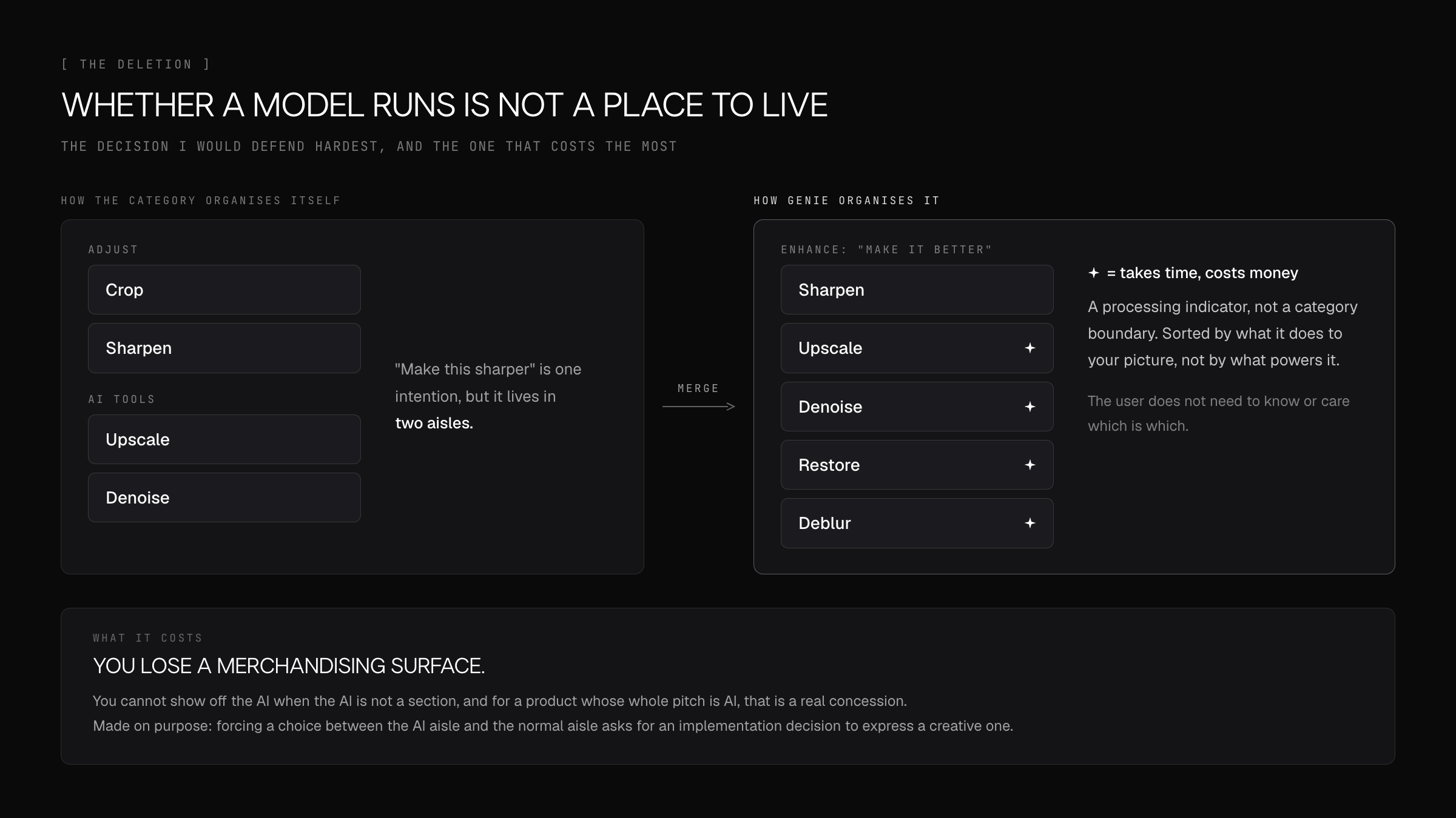
The decision I would defend hardest is a deletion. In the new taxonomy, whether an operation is AI-powered is not a category. Upscale, Denoise and Restore call models; Sharpen, Crop and Levels are arithmetic. They sit in the same menu, sorted by what they do to your picture. The AI ones carry a small marker, because processing takes time and cost, and knowing that is useful. But the marker is a processing indicator, not a place to live.
This runs directly against how the industry has organised itself since 2022, where AI is a wing of the building with its own door. That framing makes sense while the capability is novel and you are selling it. It stops making sense the moment someone is trying to get work done, because "make this sharper" is one intention, and forcing a choice between the AI aisle and the normal aisle is asking the user to make an implementation decision in order to express a creative one.
The cost is real and worth naming: you lose a merchandising surface. You cannot show off the AI when the AI is not a section. For a product whose whole pitch is AI, giving that up is a genuine concession, and I made it on purpose.
Hiding the type system without weakening it
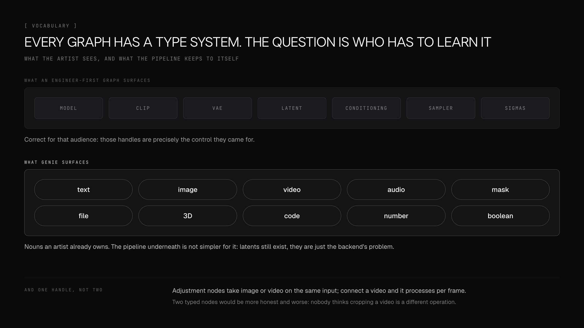
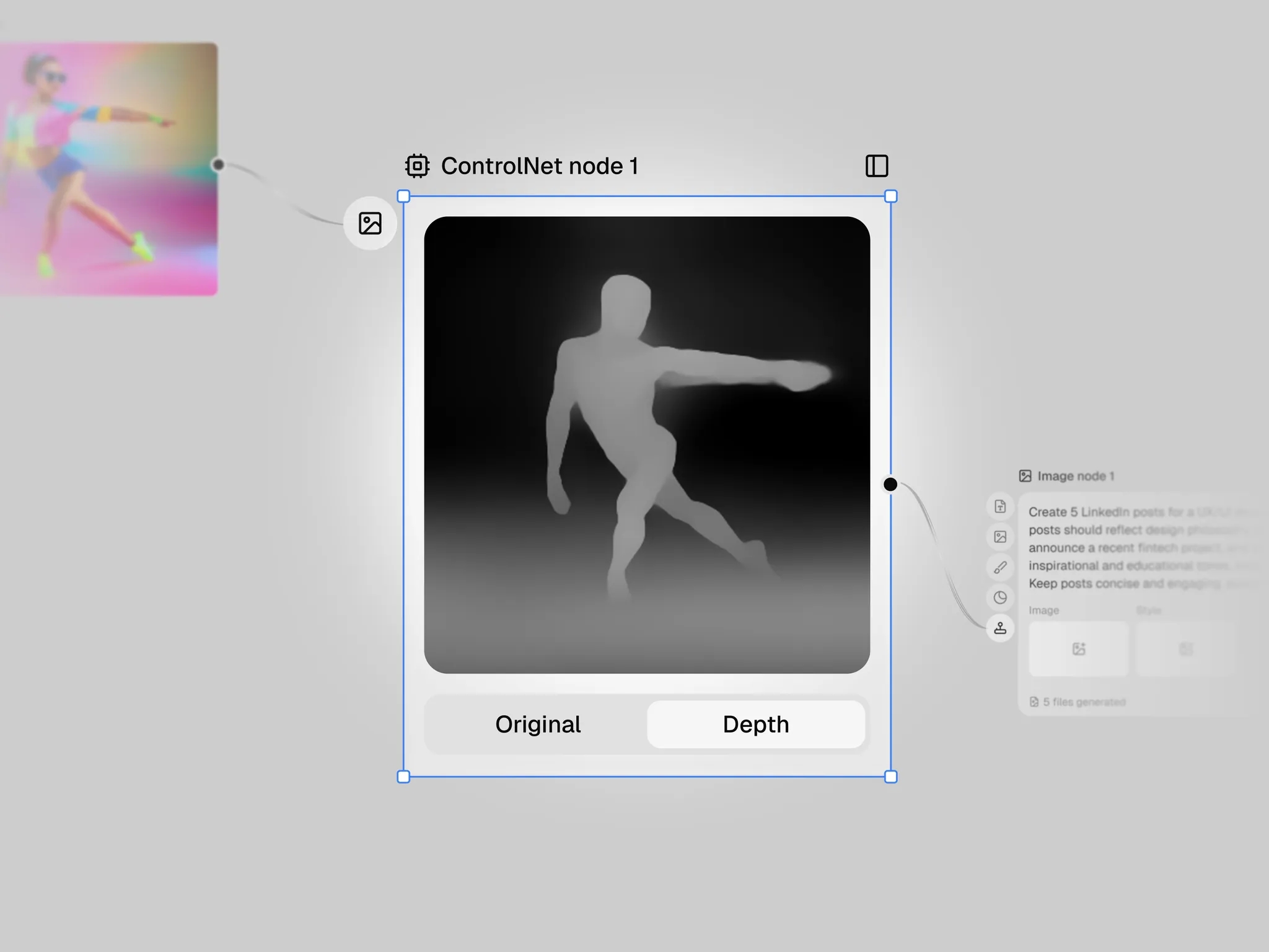
Every node graph has a type system, and the question is only whether the user has to learn it. ComfyUI surfaces its internals as first-class user-facing types — latents, conditioning, samplers, sigmas — and for its audience that is correct, because those handles are the control they came for. Genie exposes none of them. What a user sees is a short list of nouns they already own: text, image, video, audio, mask, file, 3D, code, number, boolean.
The pipeline underneath is not simpler for it. Latents still exist; they are just the backend’s problem. That is the trade the whole product rests on — the artist gets a vocabulary made entirely of things they can point at in the world, and gives up the knobs that live between those things.
The same instinct produced the detail I am fondest of. Adjustment nodes have one input that accepts either an image or a video, and the output type follows whatever you plugged in; connect a video and it processes per frame. The engineer’s version of that is two nodes with clear signatures, which is more honest and worse. Nobody thinks of cropping a video as a different operation from cropping an image, and a tool that insists otherwise is teaching its own architecture.
Three sources of truth is the same as none
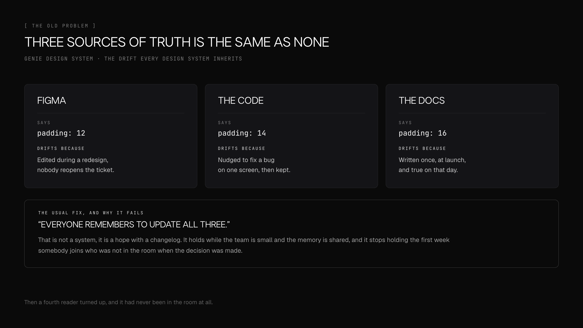
A design system usually has three descriptions of the same button: the Figma component, the implementation, and the documentation. They agree on the day they are written and start drifting immediately — Figma gets edited during a redesign, the code gets nudged to fix a bug on one screen, the docs were true at launch. The conventional answer is that everyone remembers to update all three, which is not a system but a hope with a changelog. It holds while the team is small enough to share a memory, and it stops holding the first week someone joins who was not in the room.
The drift is not caused by carelessness, which is why exhortation never fixes it. It is caused by the three artifacts having different edit costs. Changing padding in Figma takes a second and leaves no trace. Changing it in code requires a review. Changing it in the docs requires remembering the docs exist. Any system whose consistency depends on the most expensive of those happening every time will decay at exactly the rate the cheapest one gets used.
So the question is not how to keep three things in sync. It is which of them is allowed to be the source, and what mechanism makes the others derive from it rather than agree with it by convention.
Binding Figma to the component that actually ships
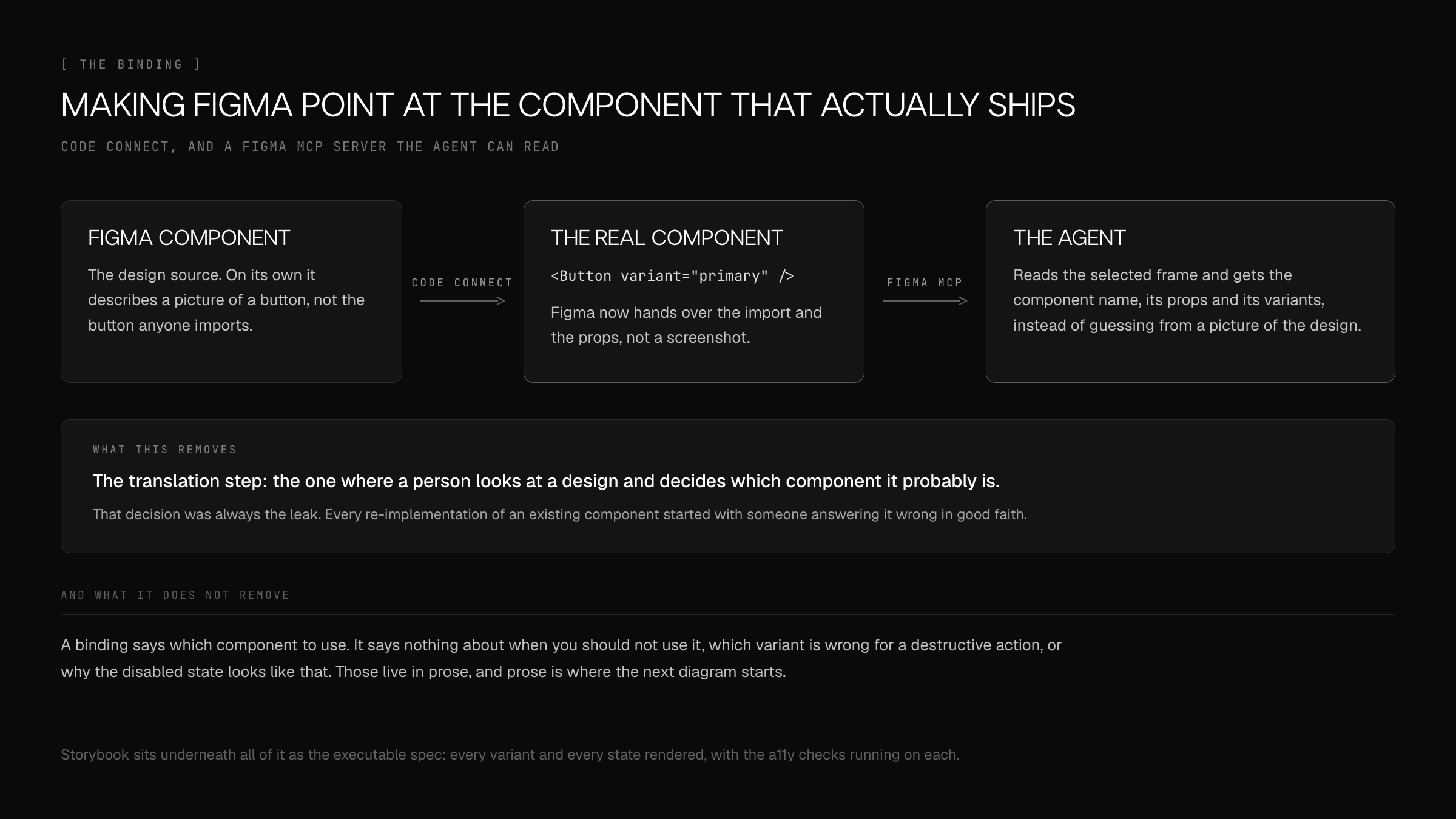
Code Connect is the first half of the answer. A Figma component gets bound to the real implementation, so Dev Mode stops handing over a picture and starts handing over the import and the props. The Figma MCP server then exposes that same binding to a coding agent: it reads the selected frame and gets a component name, its variants and its props, instead of inferring a likely-looking div from a screenshot.
What this removes is the translation step — the moment where a person looks at a design and decides which component it probably is. That decision was always the leak. Nearly every accidental re-implementation of an existing component begins with somebody answering it wrong, in good faith, because the design looked slightly different from the one in the library.
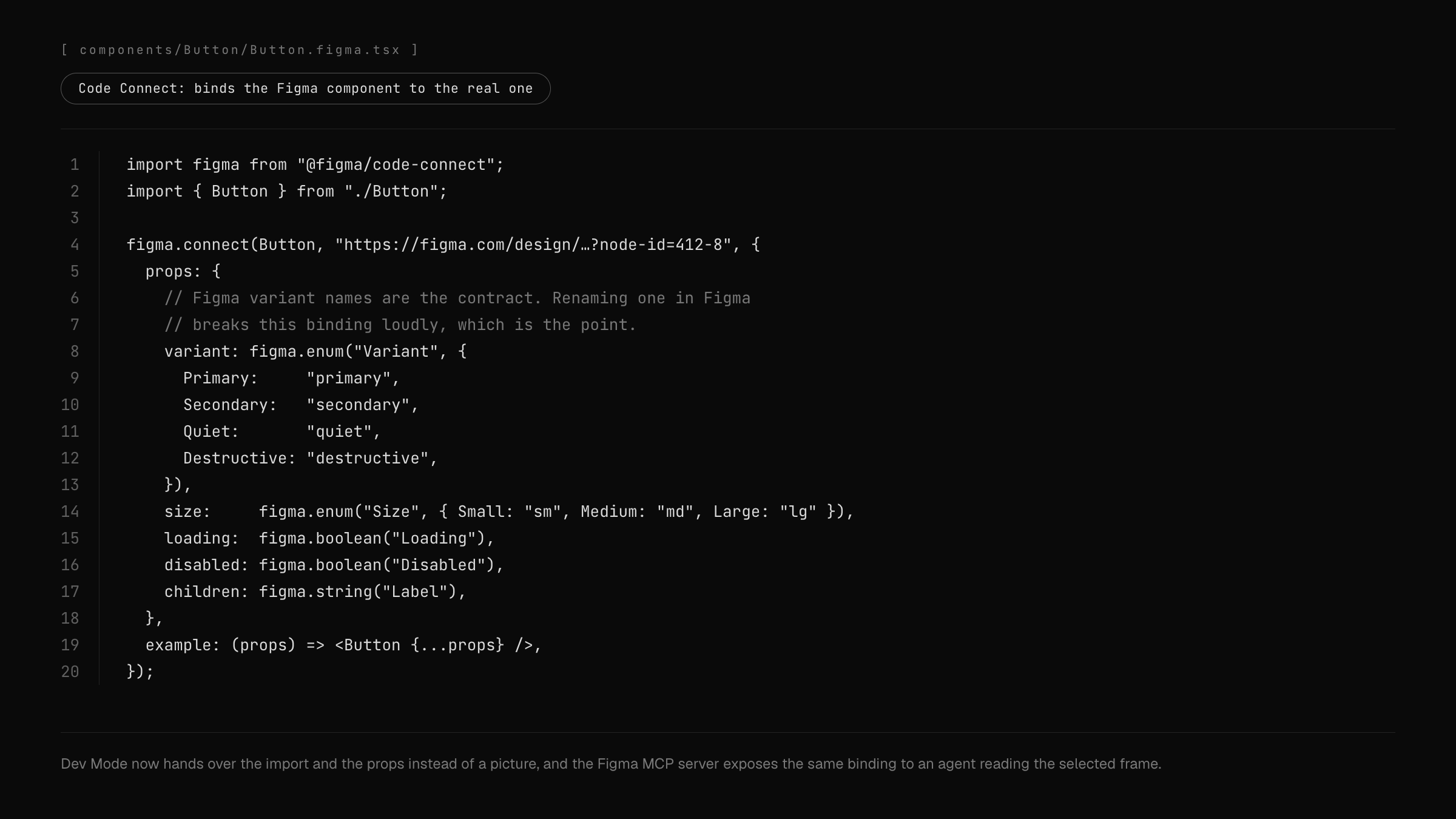
It is also a deliberately brittle binding, and that is the feature. Renaming a variant in Figma breaks the connection loudly instead of letting the two drift quietly apart. A silent inconsistency is a design-system bug that surfaces months later as a slightly wrong button; a broken build surfaces today.
The binding, written down
Bindings are also the clearest place to see that Figma variant names are load-bearing. Once "Primary" in the variant panel maps to variant="primary" in the props, the naming in the design file has stopped being a label for designers and become an interface. That reframing did more for naming discipline in Figma than any amount of asking.
What a binding cannot do is carry meaning. It says which component to use. It says nothing about when you should not use it, which variant belongs to a destructive action, or why there is no error state. That knowledge has always lived in prose, in people’s heads, and in review comments — which is exactly where the second reader runs aground.
A reader with no memory, and no one to ask
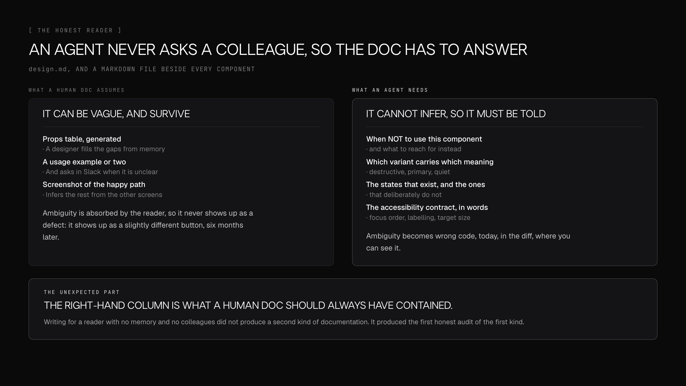
A designer reading a thin component doc fills the gaps without noticing: from the other screens, from what the team did last quarter, from a message to whoever built it. Ambiguity gets absorbed by the reader, so it never shows up as a defect. It shows up eighteen months later as four subtly different buttons and nobody able to say which one is right.
An agent absorbs nothing. It has no institutional memory, it will not ask a colleague, and it does not know which conventions are load-bearing and which are accidents. Hand it an ambiguous doc and it produces something confidently wrong — immediately, and in the diff, where you can see it.
That is a feedback loop a design system has never had. Every gap that used to be quietly filled in by a human now fails visibly and on the same day. Writing docs for a machine is, in practice, the first honest audit of the docs.
What a component doc owes an agent
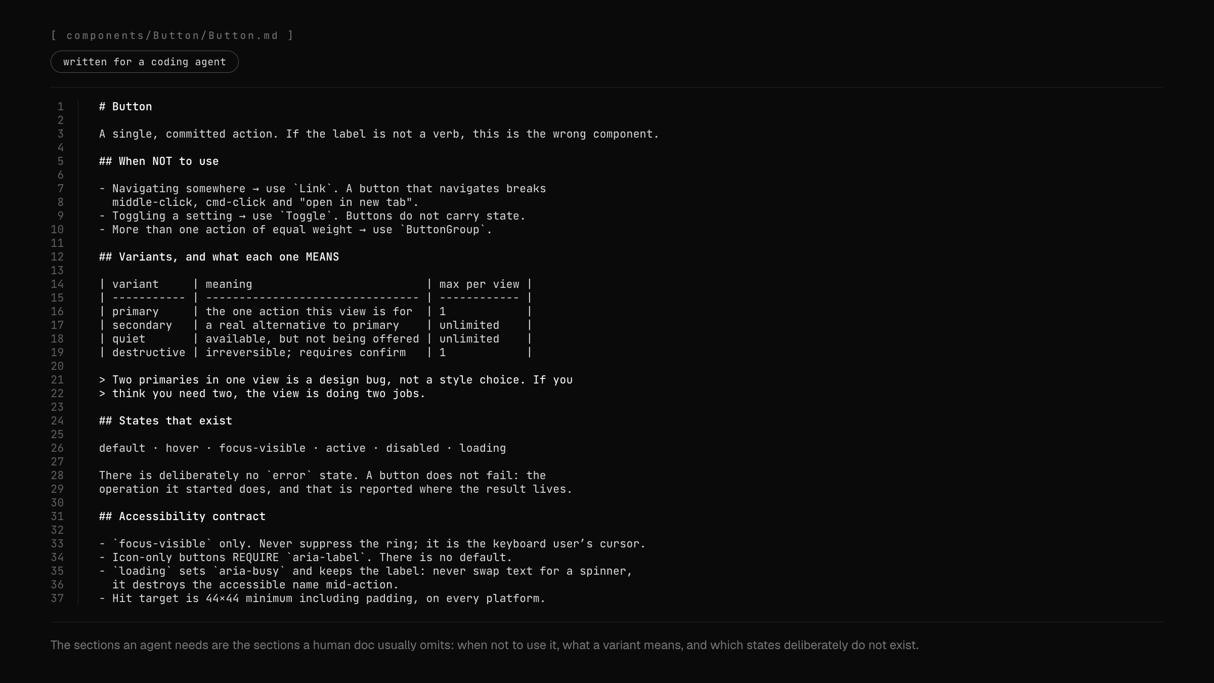
The sections an agent needs turn out to be the sections human documentation habitually omits. When not to use this component, and what to reach for instead. What each variant means rather than what it looks like — that "destructive" is a claim about reversibility, not a colour. Which states exist, and which deliberately do not, because a documented absence stops the same question being re-answered differently every time. And the accessibility contract in words: focus-visible only, aria-label required on icon-only buttons, never swap a label for a spinner because it destroys the accessible name mid-action.
Every one of those is a rule I would have given a new designer verbally in their first month. None of them was written down anywhere, because verbal transmission worked well enough that the absence was invisible.
A per-component markdown file beside the component, plus a design.md that carries the decisions spanning all of them, is a boring format on purpose. Markdown is what an agent reads well and what a person will actually edit in the same pull request as the code — which makes it the only documentation with a chance of staying true.
Storybook underneath, and what machines taught me about people
Storybook holds the layer neither the binding nor the prose can: every variant and every state rendered and executable, with accessibility checks running on each. Prose can claim a focus ring exists. A story proves it, for a human reviewing and for a snapshot diff alike.
The conclusion I did not expect is that none of this is really about agents. Nothing I wrote for a machine was a compromise for a machine. "When not to use this", "what this variant means", "which states deliberately do not exist" — that is just a better component doc, and it always was. The agent did not create a new requirement; it removed the slack that had been hiding the old one going unmet.
Which gives a test I now apply generally. If a design system’s documentation would produce wrong code in the hands of a competent reader with no context, it was never really documentation — it was a set of reminders for people who already knew the answer.
What two years actually taught me
That the hard part of designing for artists is not simplification. It is resisting the pull to expose power you are proud of having built. Every capability in this product was expensive, and every one of them wanted a place in the menu, and most of that wanting was mine rather than any user’s.
That a taxonomy is a design artifact with a version number, not a decision you make once at the start. The first one was wrong in a way that was invisible from the inside and obvious the moment someone else used it. I would now treat "the categories feel natural to me" as evidence against a taxonomy rather than for it.
And that building the thing you are designing gives you exactly one advantage and one liability, and they are the same fact. You know what is possible, so you design against real constraints instead of imagined ones. You also know how it works, which quietly makes you the worst available judge of whether the interface explains itself.
To build a simple, intuitive and powerful tool for creative minds
1. Make a web platform where you share files instantly, edit with your teammates, and skip downloading large models. 2. Open community content in one click, with no manual download or setup. We share revenue with authors to keep them motivated. 3. An AI agent helps build workflows instead of doing everything by hand, so the system stays simple but fully customizable.
Nodes
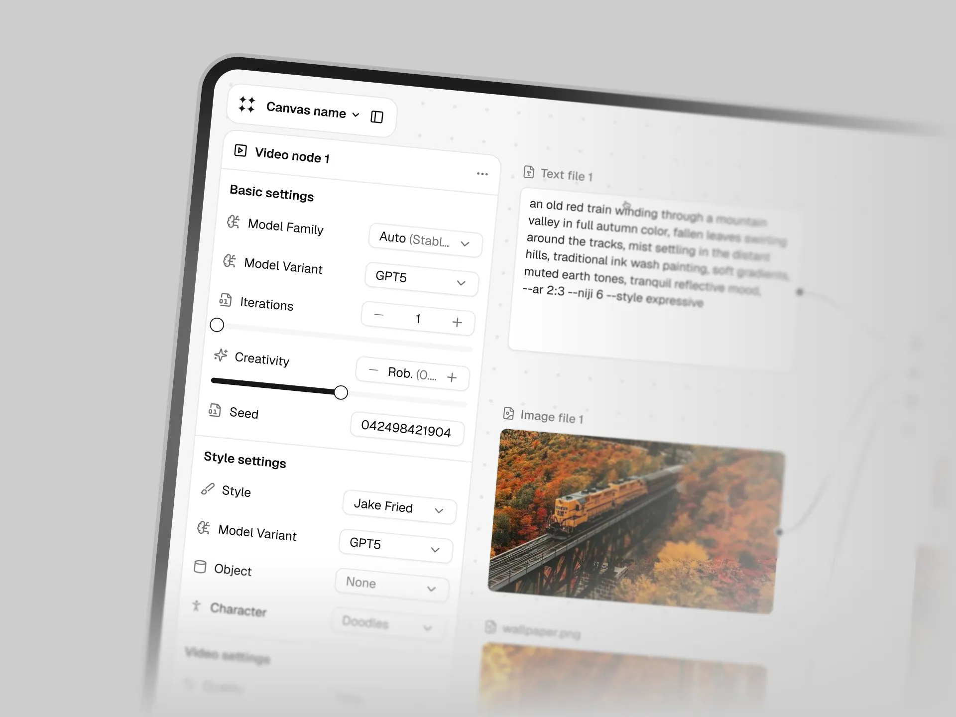
The core of the product is fully editable, detailed model settings.
Use basic nodes to generate content
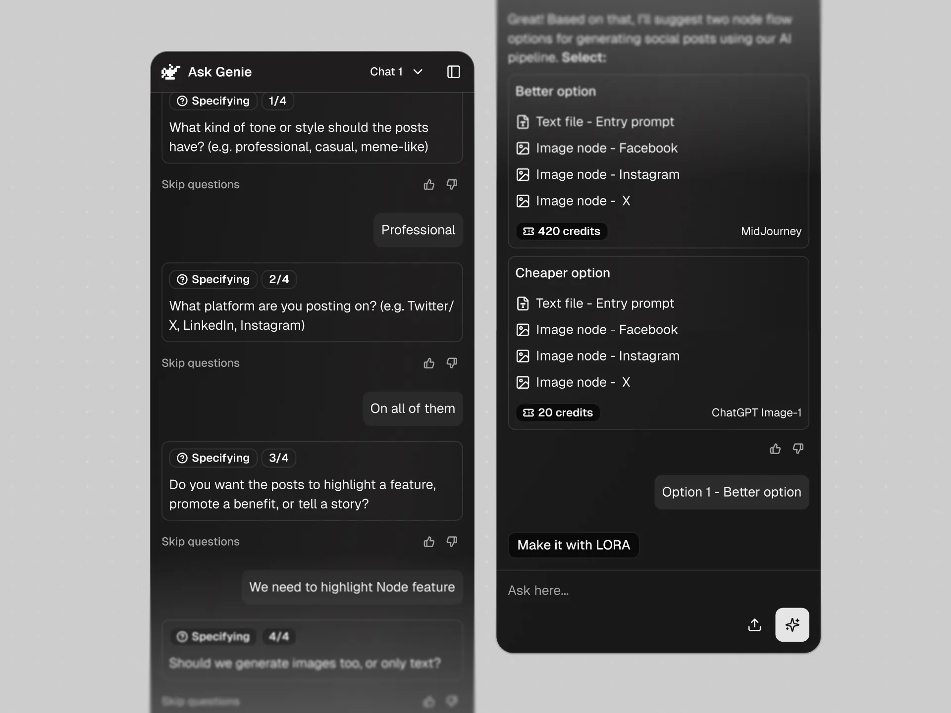
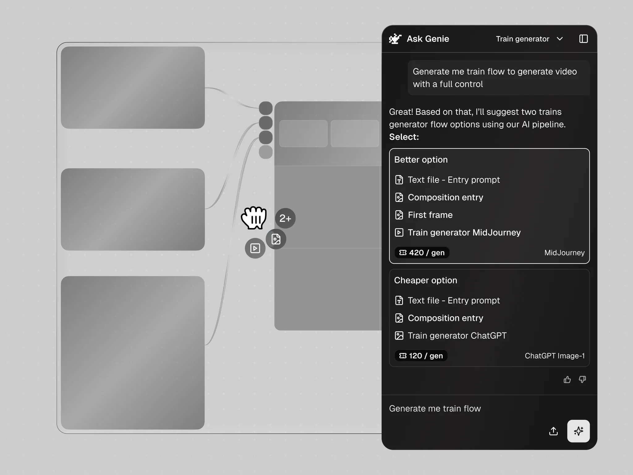
Genie AI
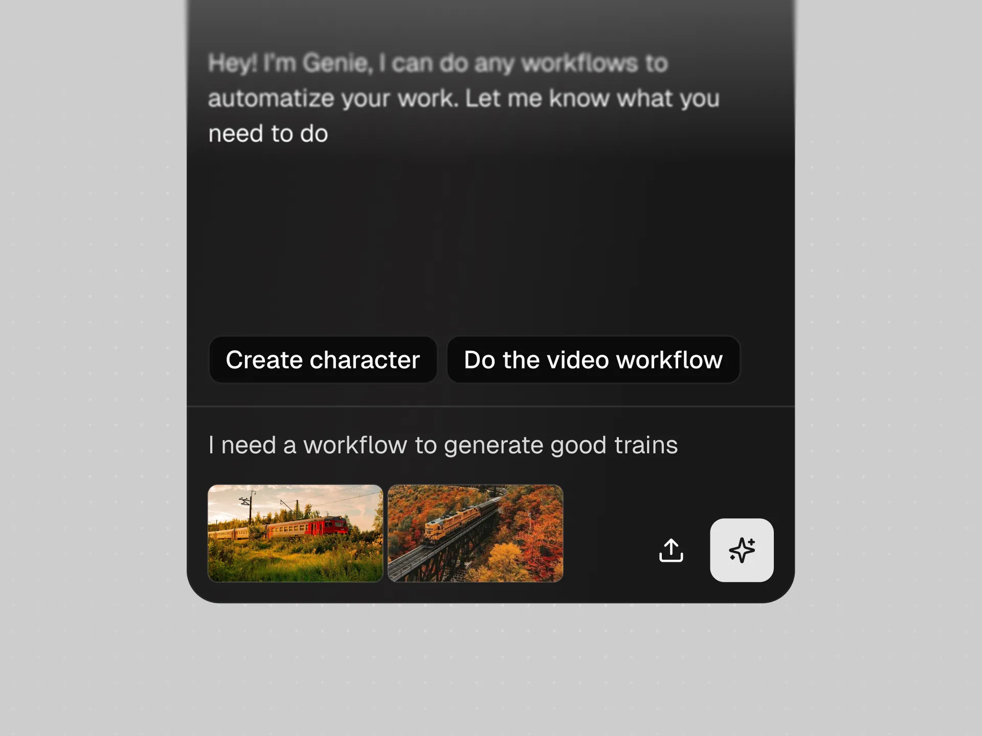
Use an agent to generate complex workflows with a few simple words
Community
Reuse community workflows instead of building everything from scratch

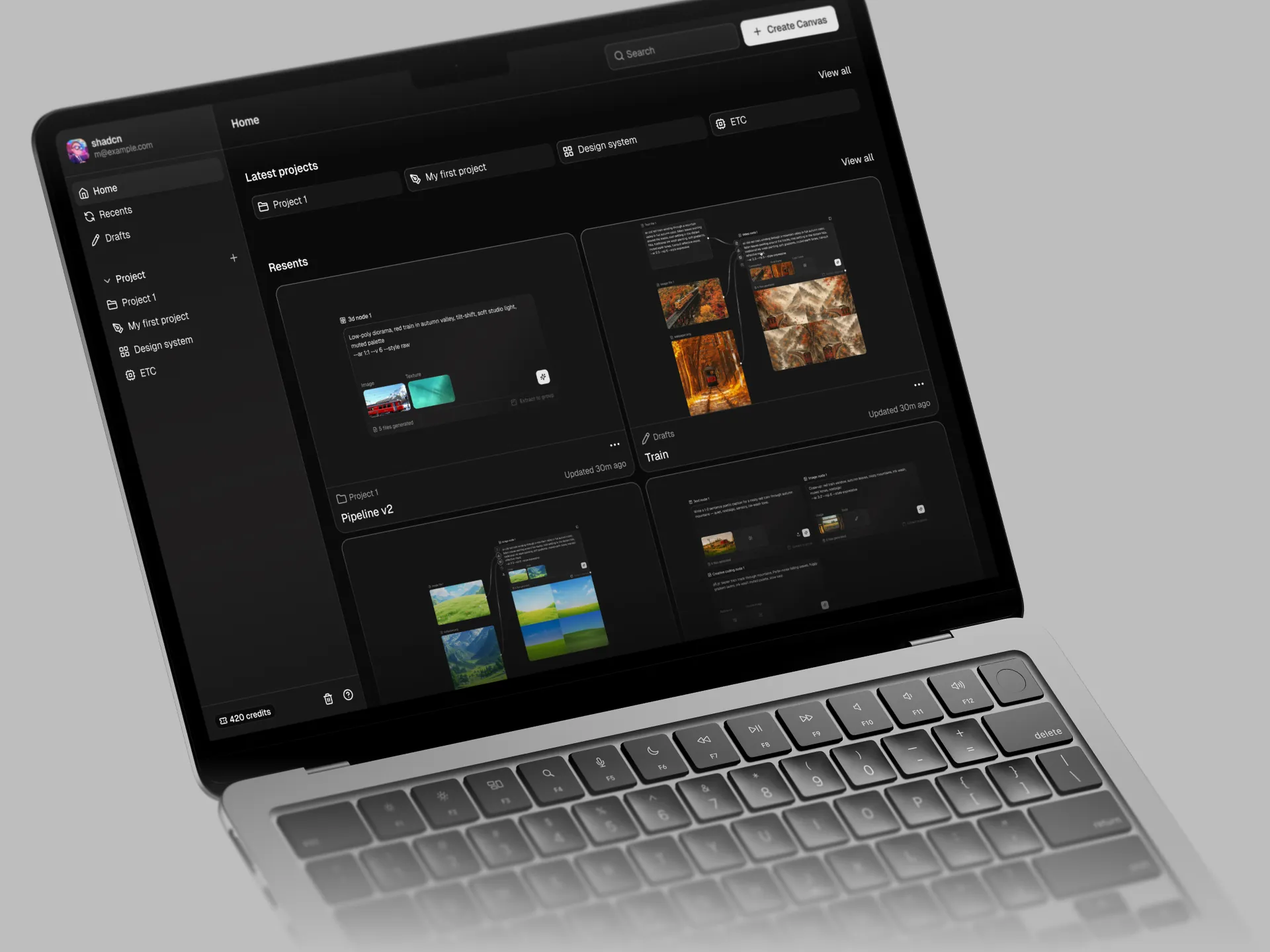
File manager
Keep canvases, projects, and assets organized in one place

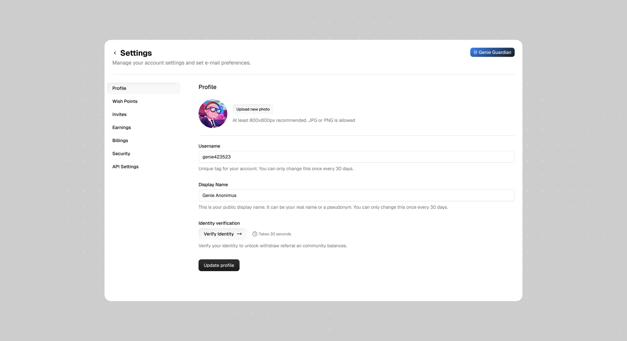
Profile
Manage your public presence, billing, and account settings
Summary
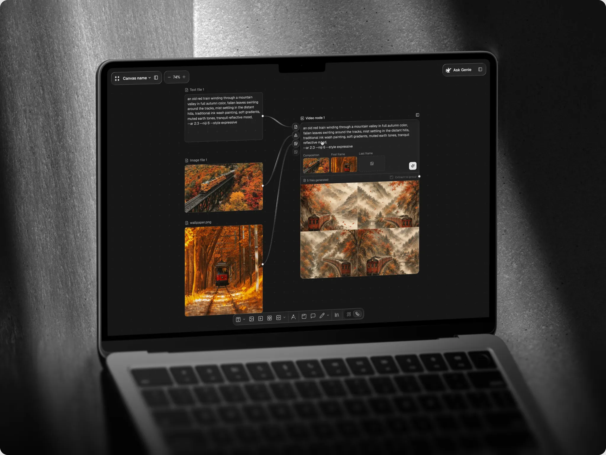
The UI in Figma
The page designs behind the tour above, as they exist in Figma.
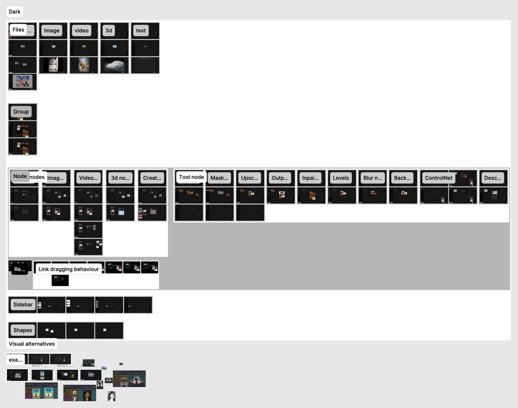
The design system in Figma
The component library described in the essay, as it exists in Figma: variants bound to the shipped components through Code Connect, and the tokens the agent reads.